This is very much a personal preference thing. Flames don't do it for me, personally. I'm a "less is more" guy, so stuff like flames, tribal graphics, graffiti bikes, busy lines, etc.-- all the stuff that you find in aftermarket decal kits -- tend to turn me off. I don't even particularly like the "strobe stripe" graphics on my track bike (fairings were already painted when I got them).
If the shape of the physical object pleases, then accentuating those lines with graphics is nice IMHO. If the shape is not that great, breaking it up with tasteful understated graphics can work too.
I have a simple litmus test. Imagine looking at the bike 15, 20 or even 50 years from now. Will those graphics still look good? Classy? Or will they look like a dated mistake?
James Bond looked great in 1962. That Bond could walk into a room today and still look good. Good taste defies time. There's a reason why Daniel Craig looked just as good -- because his style was the same. Eternal. Look at any style icon and you'll see the same. Audrey Hepburn would make jaws drop today, wearing the exact same clothes she did in the 1960s.
On the other hand, things we saw in, say, the 80s, did not fare quite so well... especially the then-popular colors and pseudo-random graphic treatments.
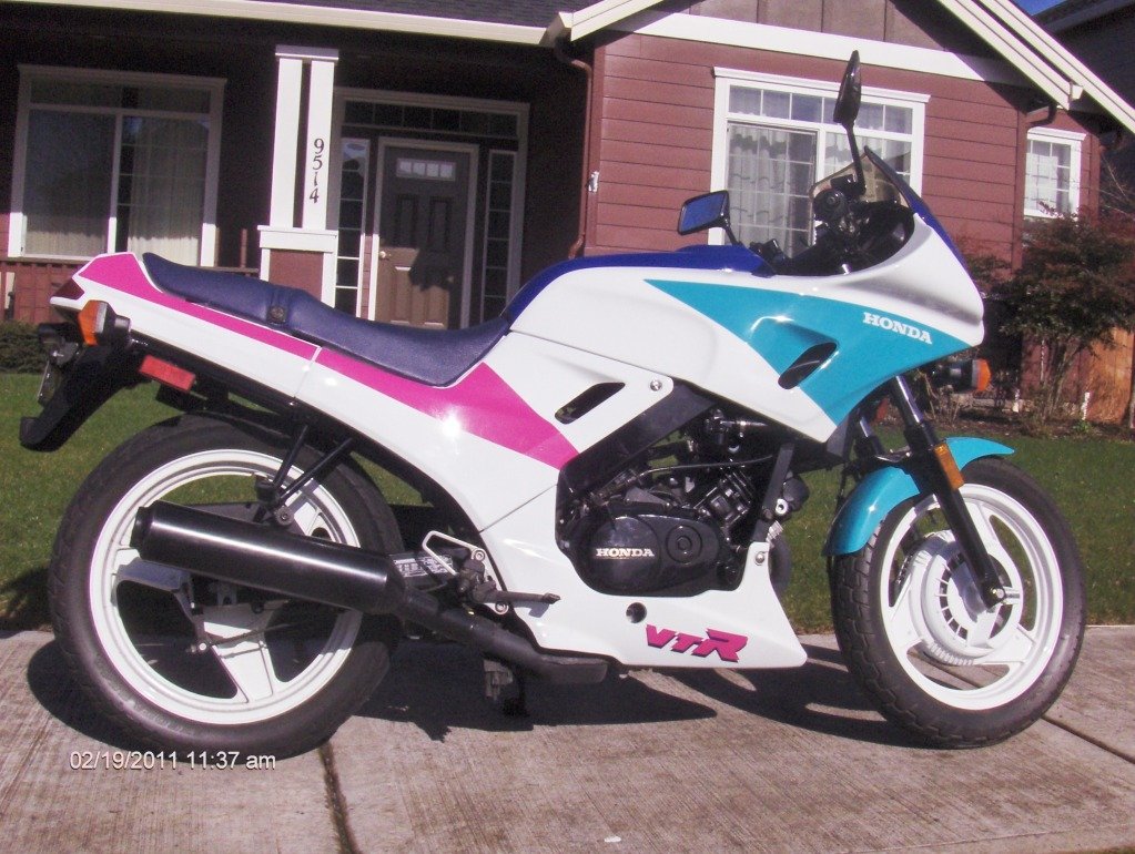
Barferrific.
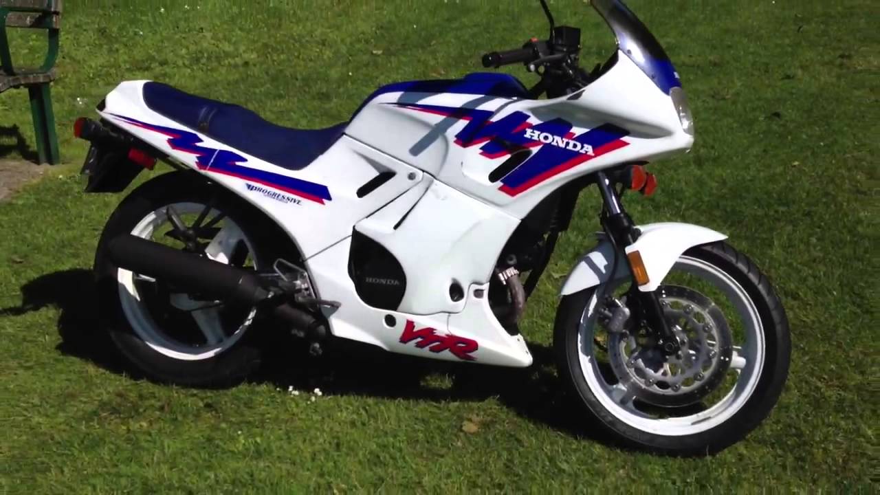
Now compare to contemporary graphics done really well:

To my eye, that's gorgeous... and it was done 32 years ago.